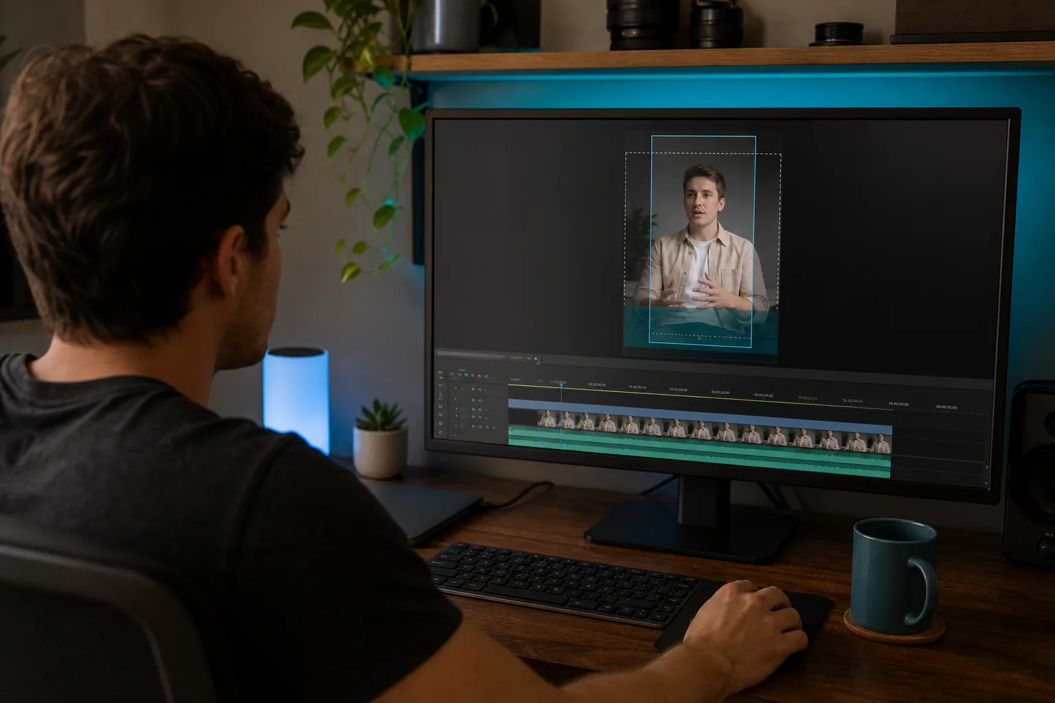
A title can look clear in your editor, then vanish under TikTok’s buttons. TikTok safe zones help you keep key text and visuals clear of the app’s interface, but the bottom margin is the one that catches many creators off guard: a suggested 380 pixels on a 1080 × 1920 frame.
Use the measurements below as a working guide, not a fixed TikTok rule. The interface can shift, so preview the finished clip before you post it.
What TikTok Safe Zones Are and Why the Interface Matters
A safe zone is the part of a video where important content is less likely to sit beneath TikTok’s on-screen controls. Outside that area, the app may show navigation, a creator name, captions, or a column of buttons. The video still plays, but parts of your message can be hard to read.
The idea is older than social apps. TV production used safe areas to keep key picture details inside the part of a screen viewers could reliably see. On TikTok, the same idea helps creators place titles and subtitles around a changing mobile interface.
There isn’t one fixed margin for every TikTok placement. Keep key text and logos within the marked area to reduce the chance they’ll be covered or cropped. Organic videos can have different interface layouts, so treat general pixel guides as starting points.
This matters for interview clips, sermons, and course lessons. A speaker’s key phrase may land behind the caption area, while a call to action can sit beneath the right-side buttons. Before posting, check the clip in the app, not only on your editing canvas.
If your week is already full of recording and publishing, PenguinClip’s done-for-you video clipping service turns long-form recordings into captioned vertical clips. Safe-zone checks still matter, especially around baked-in subtitles.
TikTok Safe-Zone Dimensions and Usable Margins
A common working canvas is 1080 × 1920 pixels, or 9:16. The measurements below are suggested clearances for that frame. They describe where to keep important material, not a formal TikTok-wide specification.
- Top: Keep titles and headlines about 180 pixels below the top edge. This leaves room for navigation controls.
- Bottom: Leave about 380 pixels clear for the creator handle, captions, and subtitles. This is the largest suggested margin.
- Sides: Keep key content about 120 pixels from either edge. Treat the right side with extra care because interface buttons sit there.
- Right-side buttons: Keep critical text and logos about 140 pixels from the right edge. Some guidance uses a wider 180-pixel buffer for the button column.
- Profile logo: For a square ad profile image, keep the key part of the logo within the center 66 × 66 pixels of the 98 × 98 image.
These figures come from different production guides and can overlap. A 120-pixel side margin and a 140-pixel right clearance are not two amounts you need to add together. Use the wider boundary on the right when you want more breathing room.
On a 1080 × 1920 canvas, a 380-pixel bottom margin uses nearly one-fifth of the frame’s height. That is why a subtitle line placed close to the lower edge can disappear even when it looks fine in your editing software. Put the lowest line higher, then check it against the actual app controls.
For a project, add guides to the canvas at the suggested boundaries. Keep background footage full-screen, but place any words that must be read inside the central area. If you need a refresher on the canvas itself, PenguinClip’s TikTok video format and size guide covers the vertical frame and related specs.
Where to Place Titles, Captions, Logos, and Key Visuals
Give each element a clear job, then place it where the app is least likely to cover it. One crowded corner can make a clean clip feel hard to follow.
Titles and speaker names
Keep the opening title below the top buffer. For an interview, a short speaker name or topic line can sit in the upper-middle part of the frame. Avoid placing it flush with the top edge, where navigation controls may overlap it.
Use short lines and leave space around the speaker’s face. If the clip has a lower-third name tag, check the lower margin carefully. A second title can compete with subtitles, so choose one clear place for each.
Captions and subtitles
Keep subtitles above the lower interface area. For clips with several lines of dialogue, move the full caption block upward rather than letting the last line rest near the bottom. This is especially useful for sermon excerpts and podcast clips where viewers may rely on captions to follow a key point.
If TikTok’s own captions appear on top of baked-in subtitles, the text can become crowded. Preview the clip with the intended caption setting, and check that the line breaks still make sense. For help with the text itself, use the steps in our guide to adding captions to TikTok videos.
Logos, calls to action, and faces
Keep a logo small and away from the outer corners. A full-square logo may lose its edges in a small profile image, so keep its main mark centered. On the video frame, leave space on the right for the interaction buttons.
Place calls to action where viewers can see them without covering the speaker or important captions. A brief spoken prompt can work better than a large text block near the bottom. For an ad placement, preview both the opening screen and the in-feed view.
For busy creators, our team at PenguinClip handles clipping, captioning, and title overlays for weekly vertical content. When you review a delivered clip, the main check is simple: scan the top, bottom, and right edge before posting.
Templates and Editing Tools for Checking Safe Zones
A guide layer makes safe margins easier to see while you edit. It should help you spot collisions, then stay out of the exported video.
Canva guides
In a vertical Canva design, turn on rulers and guides from the file menu. Drag vertical guides inward from the ruler at the left, then place matching guides near the right edge. Add horizontal guides for the top and bottom margins. A common tutorial uses about 250 pixels on the sides and top, then about 400 pixels at the bottom. Those are roomy working guides, not the only valid measurements.
Keep these lines visible while you place titles and subtitles. The guides don’t need to be part of the final export. Backgrounds can cross the lines; text that must stay readable should not.
Editing tools, Premiere, and overlay templates
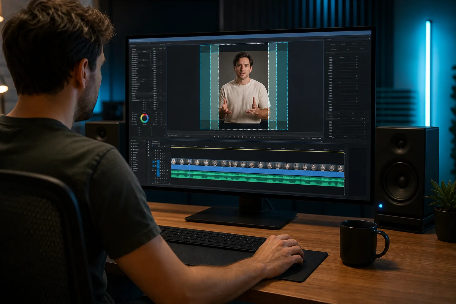
An editing tool may offer a TikTok safe-zone overlay that can be switched on while you edit. The overlay is meant to guide placement, rather than appear in the finished export. In Premiere or another editor, you can use a transparent PNG guide as a top layer, lock it while you work, then hide it before export.
For paid placements, check the applicable safe-area requirements before exporting.
A cross-platform guide layer
A screenshot-based overlay can help when one clip is headed to more than one app. Place a screenshot of the app interface above the footage, then try a blend mode such as Screen so dark areas drop away and bright markers remain. This is a visual aid, not a master safe zone: TikTok, Reels, and Shorts have different controls.
Keep separate platform guides when text placement needs to be exact. One wide central area can help with early framing, but it won’t replace a final check in each app.
Troubleshooting Safe-Zone Issues Across Video Types and Platforms
If a line of text gets cut off, first check where it sits in the exported frame. Then check the clip in TikTok. The editor view alone can’t show how every app control will sit on a phone screen.
Subtitles disappear near the bottom
Move the whole caption block higher, not only the last line. For dialogue-heavy clips, leave enough room for a second line to appear without pushing the first line into the speaker’s face. Preview a few points in the clip, since subtitle blocks can change height as the words change.
Titles or logos touch the edge
Pull them inward and check the right side first. TikTok’s button column can cover text or a small logo placed too close to the edge. Also check for cropping in a square profile image, where the main logo mark needs room around it.
The same clip is going to several platforms
Keep a clean master video, then check text placement for each destination. A TikTok overlay can’t tell you exactly where another app’s controls will sit. If a title is central and a subtitle block stays above the lower controls, the clip may need only small changes for another platform.
Text-heavy lessons need a larger clear area for captions. In a graphic-heavy clip, keep the central subject or product visible and let background design extend beyond the guides. For paid placements, use the matching ad preview and check the placement’s own safe area before launch.
When an issue appears only on one device, don’t assume the viewer made a mistake. Screen size and interface layout can affect what overlaps. Keep the edit flexible enough to shift a title or subtitle block, then review the updated export in the app.
Frequently Asked Questions
What is the safe zone for TikTok videos?
A TikTok safe zone is the part of a vertical video where key text and visuals are less likely to be covered by the app’s interface. It’s a working layout guide, not one fixed boundary for every video. The interface can vary, so keep essential text away from the edges and preview the finished clip in TikTok.
What are the safe-zone margins for a 1080 × 1920 TikTok video?
Common working margins are about 180 pixels at the top, 380 pixels at the bottom, and 120 pixels along the sides. Keep important material about 140 pixels from the right edge, or use a wider buffer near the buttons. Treat these as creator guidance, because interface layouts and ad formats can differ.
Where should I put subtitles on TikTok?
Place subtitles in the lower-middle part of the frame, above the creator name and caption area. Keep the entire caption block clear of the bottom margin, including any second line that appears. If TikTok’s own captions will also show, preview the clip with them turned on so the two text layers don’t compete.
Can I use one safe-zone template for TikTok, Reels, and Shorts?
You can use one broad central guide while you frame a clip, but it won’t match every platform’s interface exactly. Each app places controls in different areas. For final checks, use a guide for each destination and preview the clip in that app before posting, especially when text sits near an edge.
Do Canva guides show in the exported video?
Canva rulers and guides are editing aids, so they aren’t meant to appear in the exported design. You can use them to set a safe working area, then download the clip without the guide lines. Before posting, view the exported file on a phone and confirm that titles and subtitles still sit clear of the app controls.
Conclusion
Start with the larger bottom margin, then check the top and right edges in the TikTok app. If you’re adapting the same vertical clip for another platform, compare its layout with our Instagram Reels safe-zone guide before publishing.